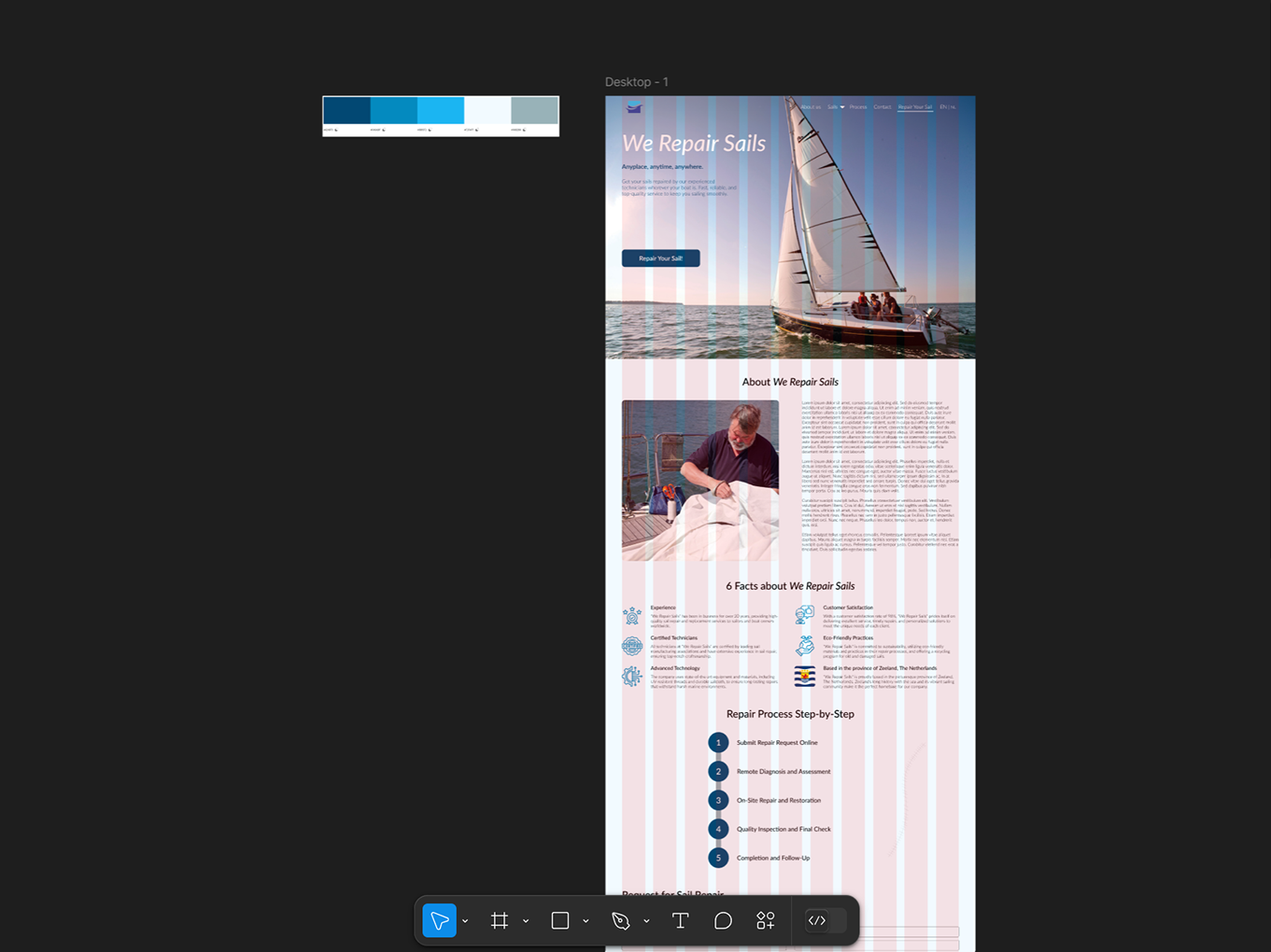
During my Communication and Multimedia Design (CMD) studies at the Amsterdam University of Applied Sciences (AUAS), I completed a second‑year course called Responsive Multi‑Device Design (RMDD). For this course, I was tasked with developing a new concept and designing a fully responsive app across multiple screen sizes. The assignment required me to think beyond a single device and create a cohesive user experience that works seamlessly on both mobile and desktop.
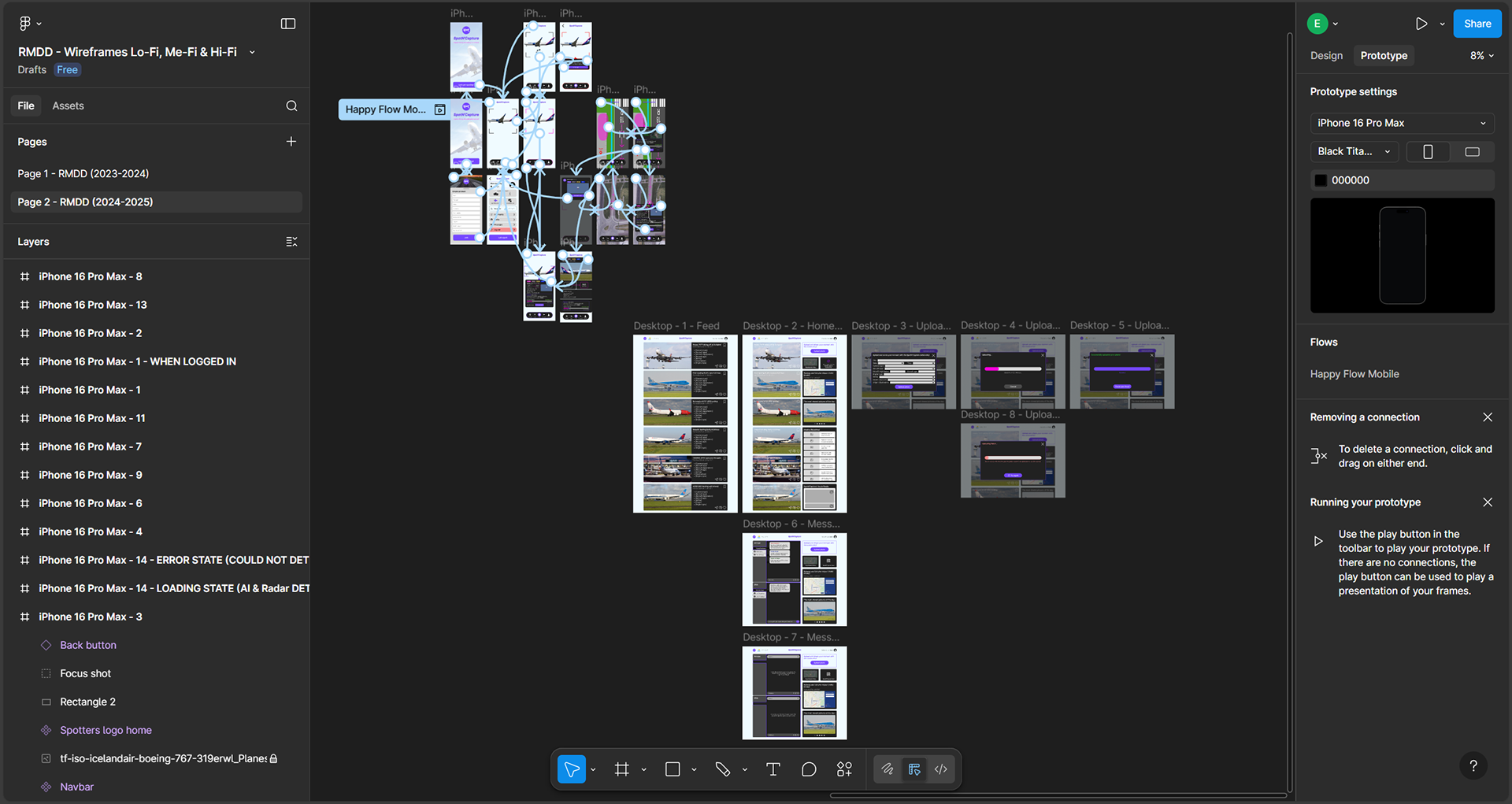
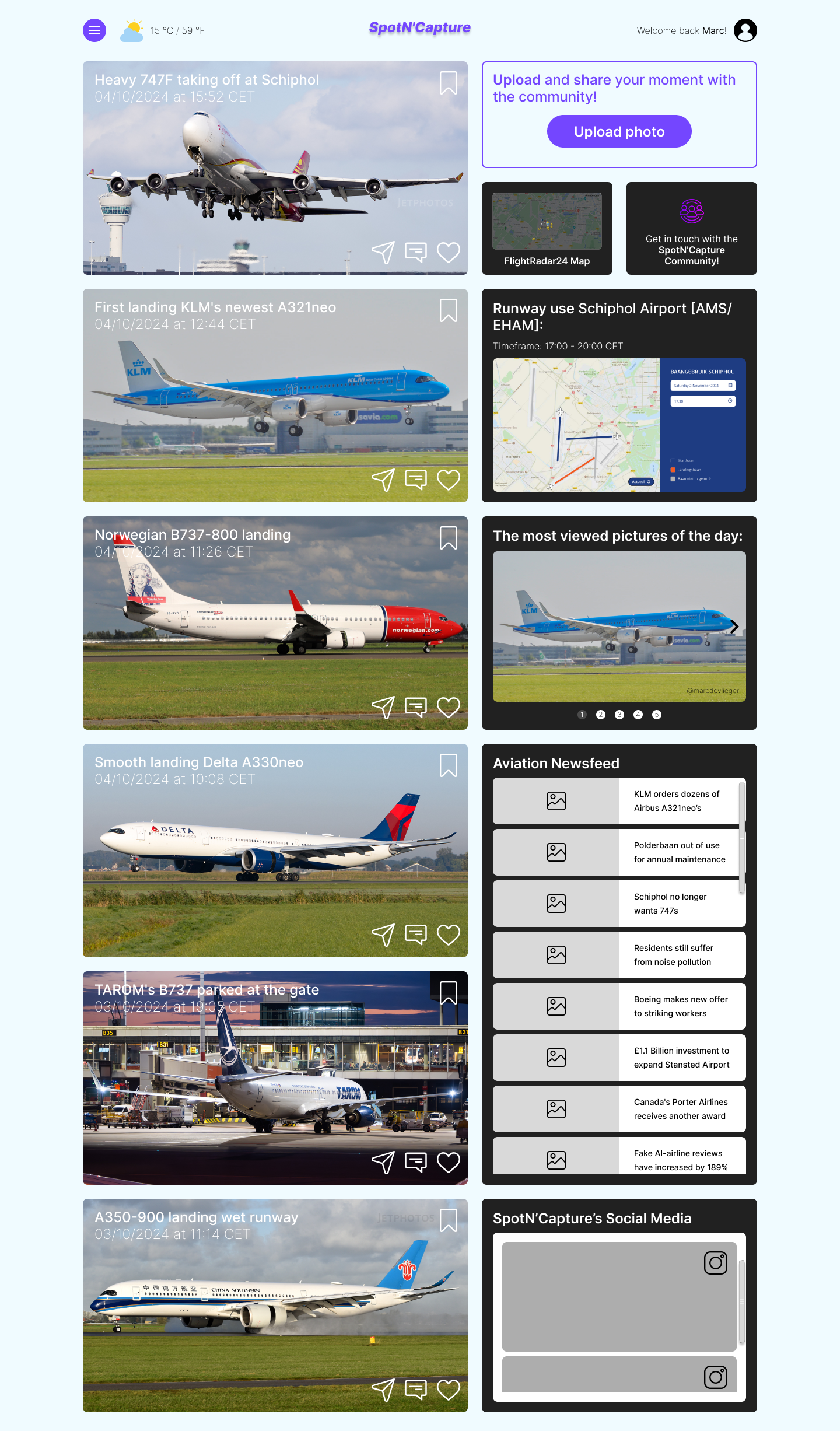
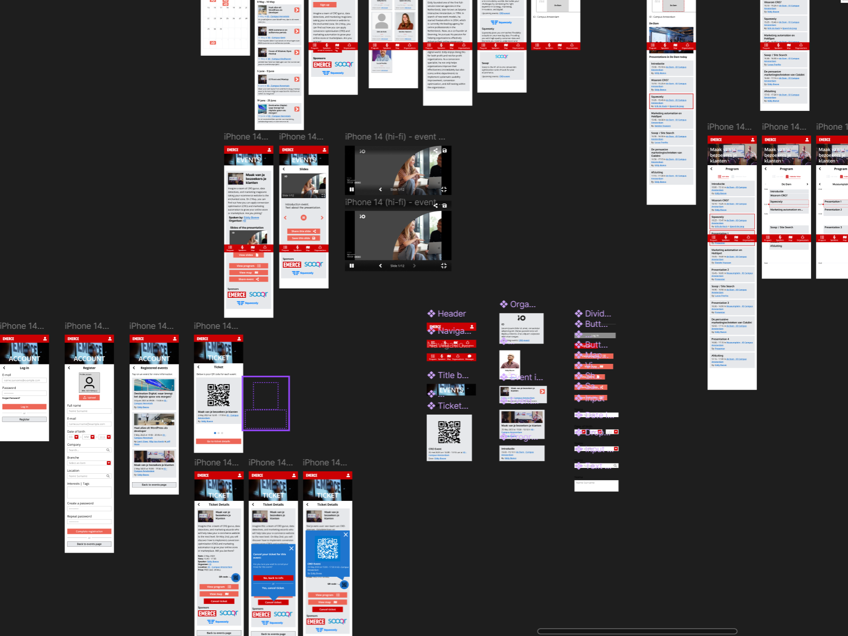
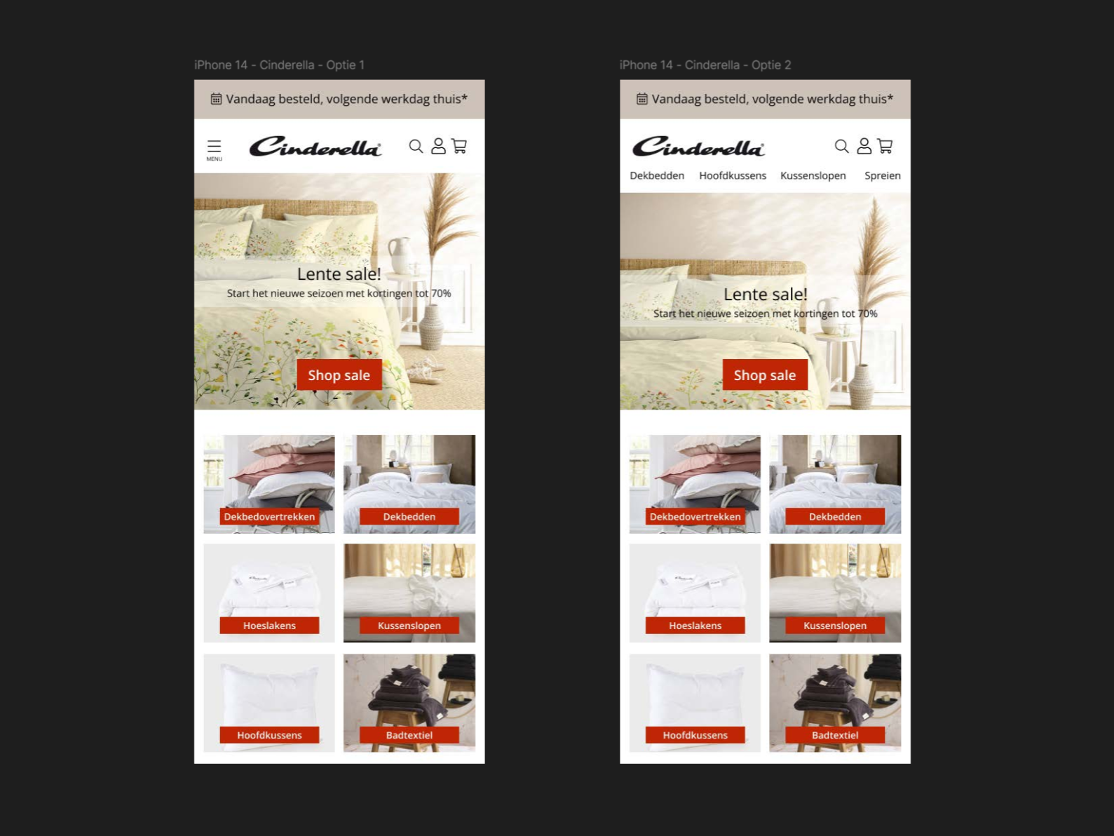
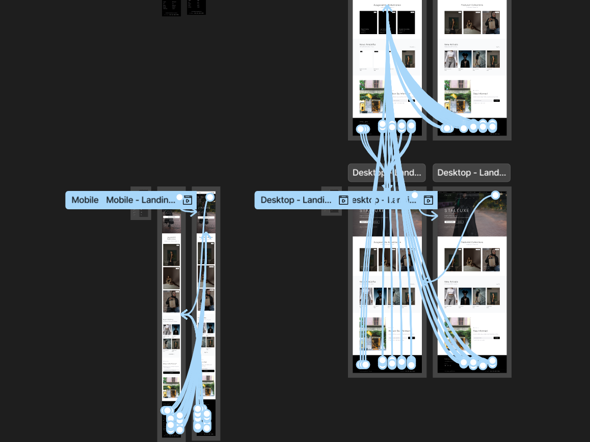
As shown above, I designed both the mobile version and the full desktop version in Figma. These two formats were sufficient for the assignment, where the focus was primarily on delivering solid Me‑/Hi‑Fi wireframes. For completeness, I also created an interactive, clickable prototype of the mobile version, which you can find embedded at the bottom of this page. In a real project, I would additionally design a tablet version and potentially explore a smartwatch UI to support features such as notifications about optimal spotting locations or incoming and departing flights/aircraft. Across all wireframes on multiple device formats, I ensured consistency in layout, interaction (design) patterns, and visual design.
Below, you can browse through the full case study document (or in Dutch, the ‘Productbiografie’), which includes the entire process (in Dutch) — from research, ideation and conceptualization to the user journey, user scenario, user requirements, used design patterns, the 3C’s Framework, a screenflow, and the complete UI stack with all the (component) states. The document also shows my weekly progress, interim feedback moments with my lecturer, and a final Design Critique conducted with a fellow designer.
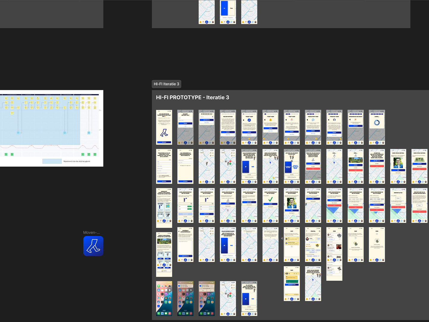
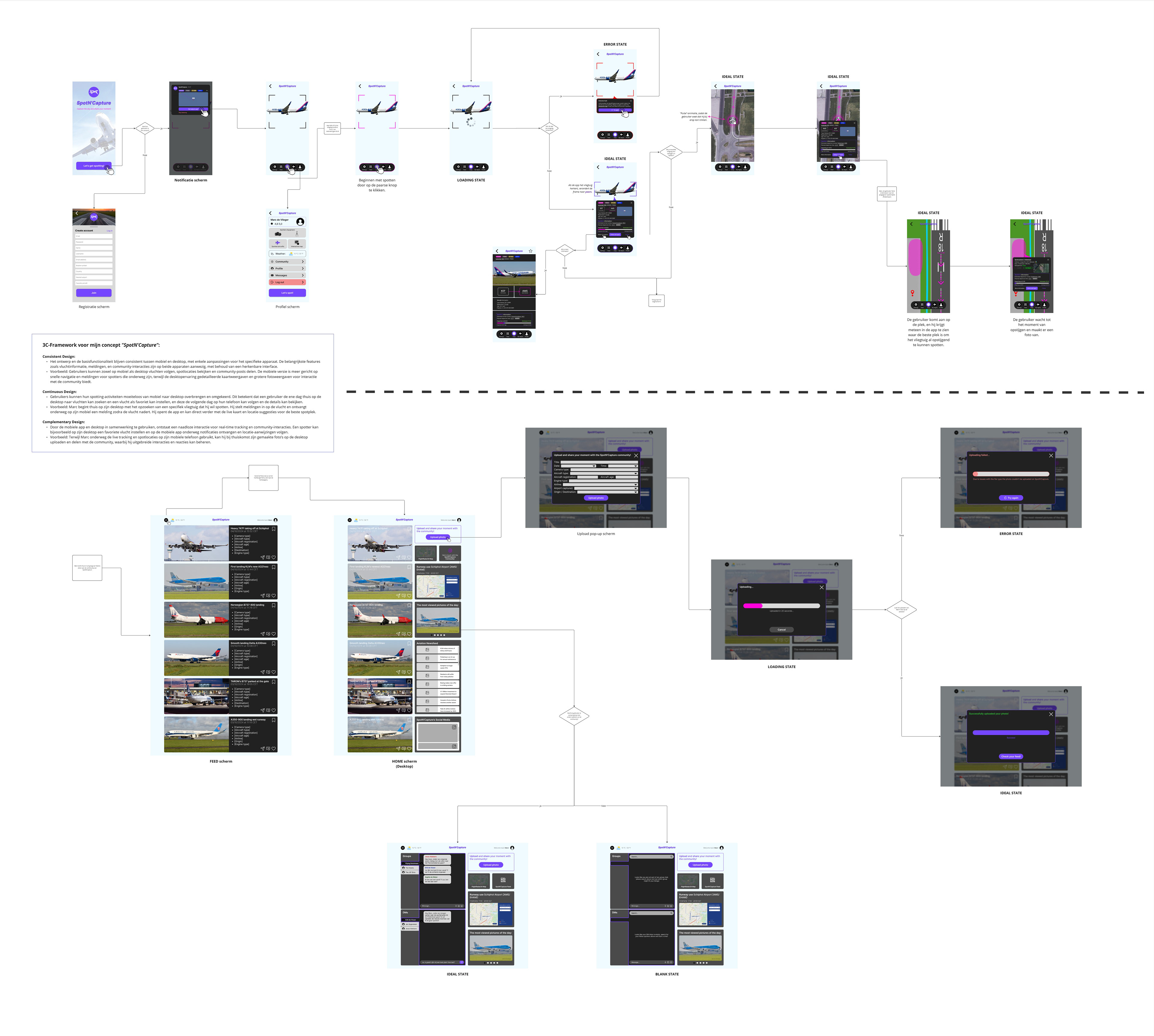
Screenflow SpotN'Capture App
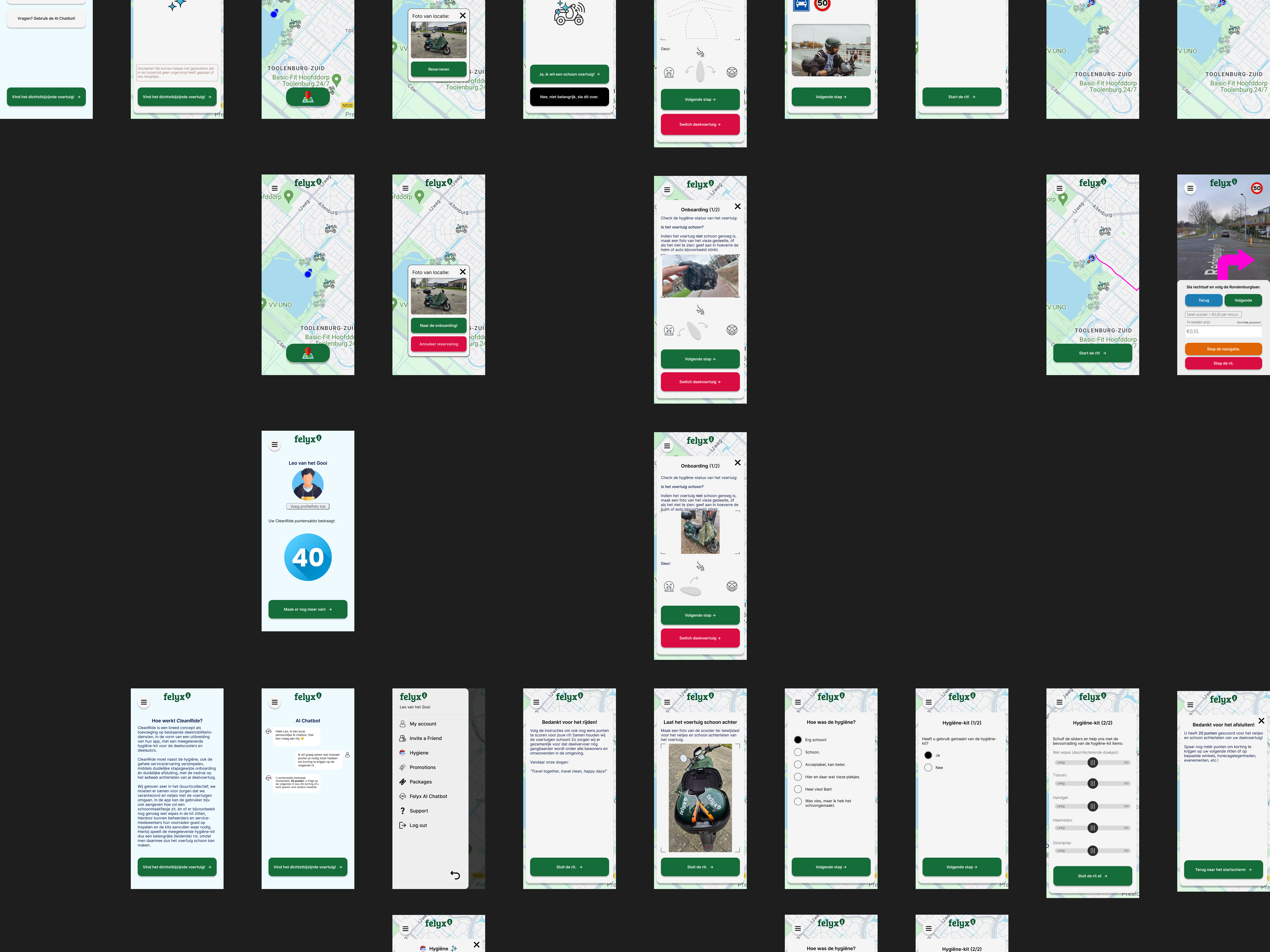
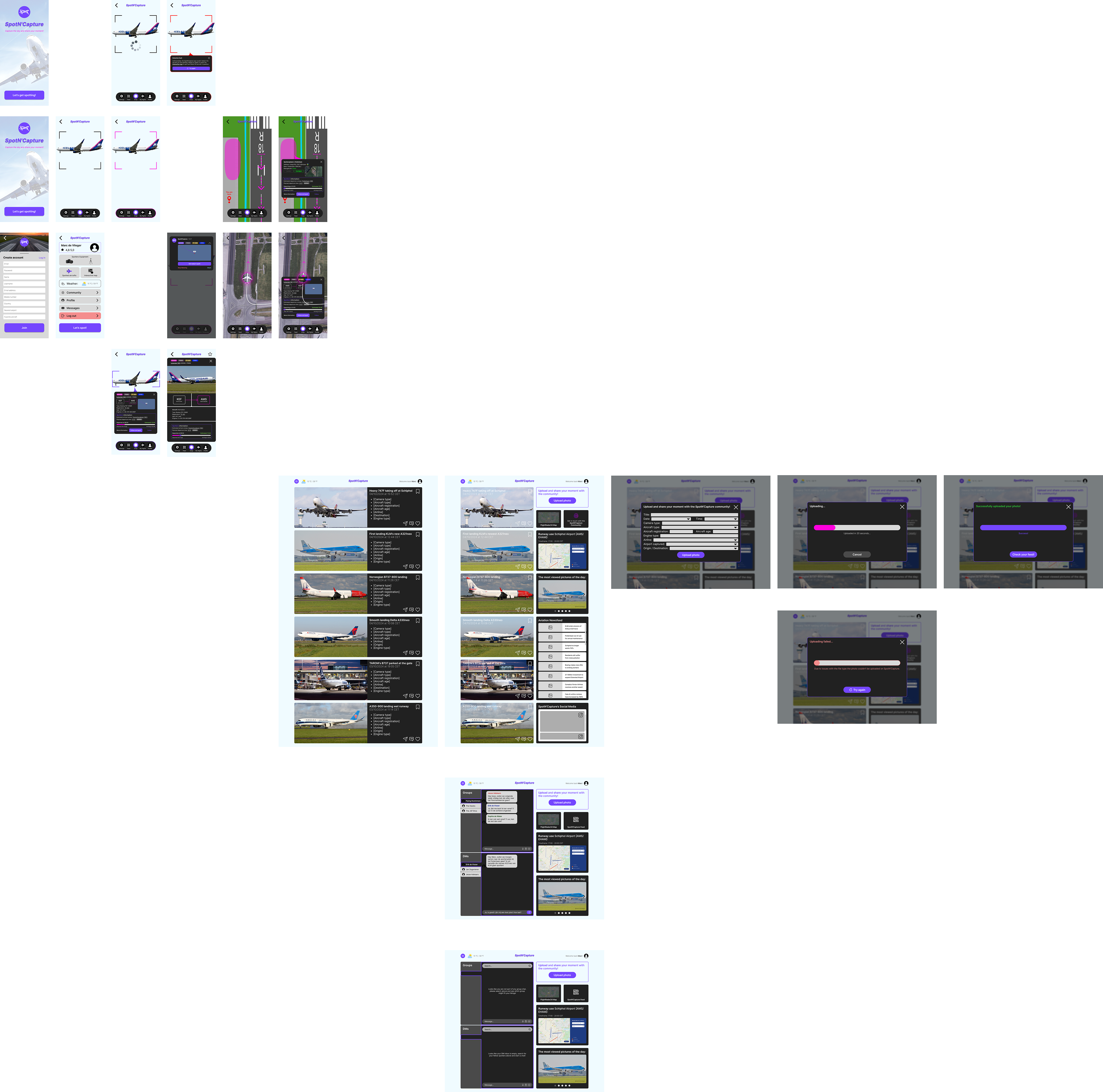
Final version Hi-Fi wireframes SpotN'Capture App
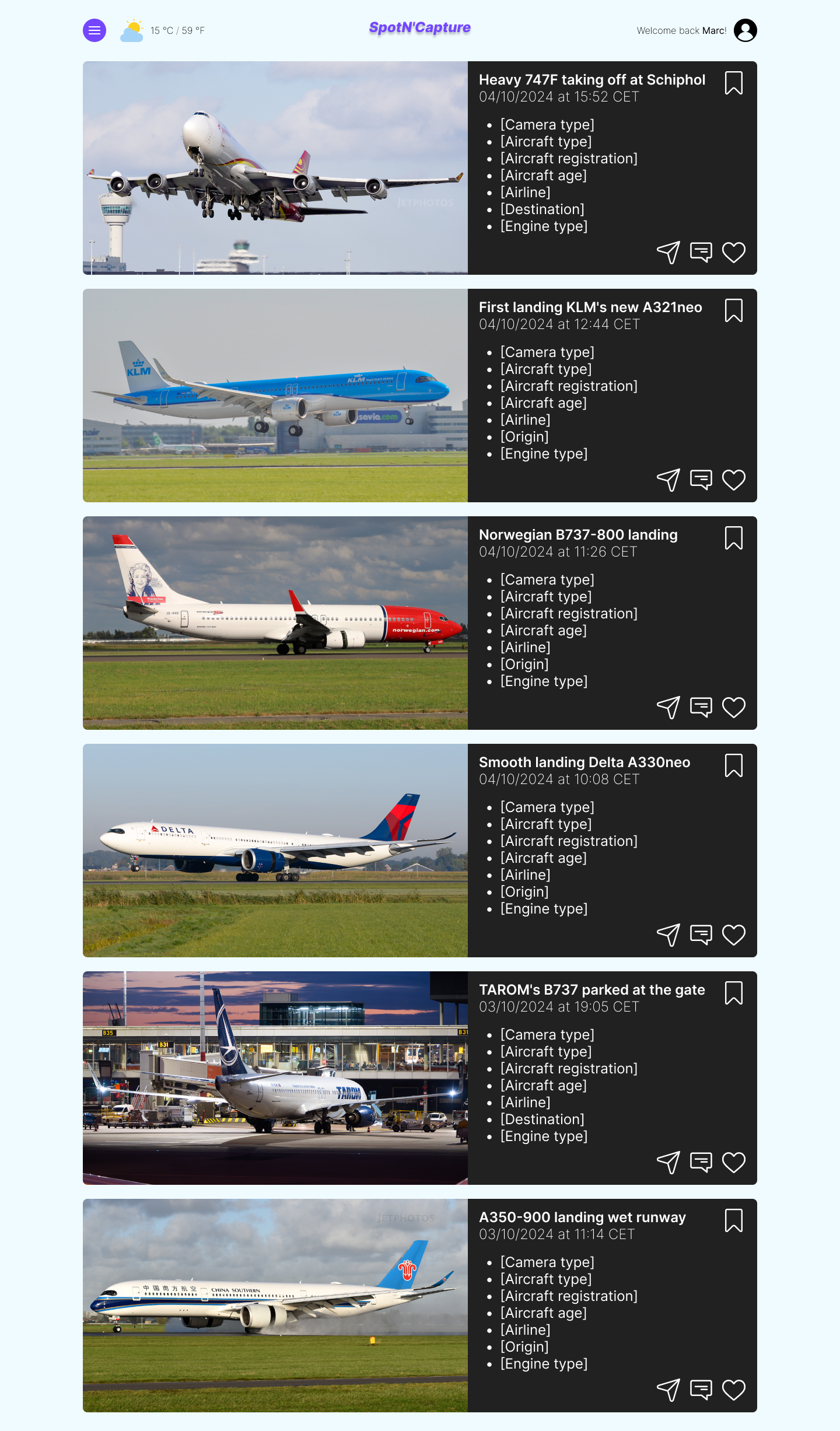
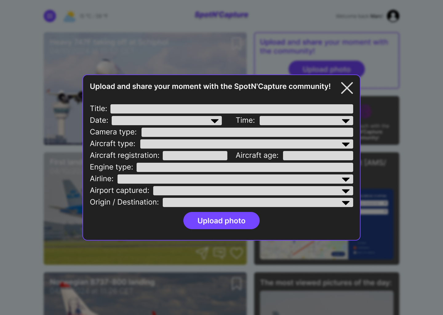
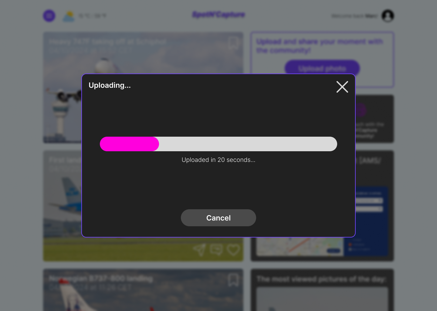
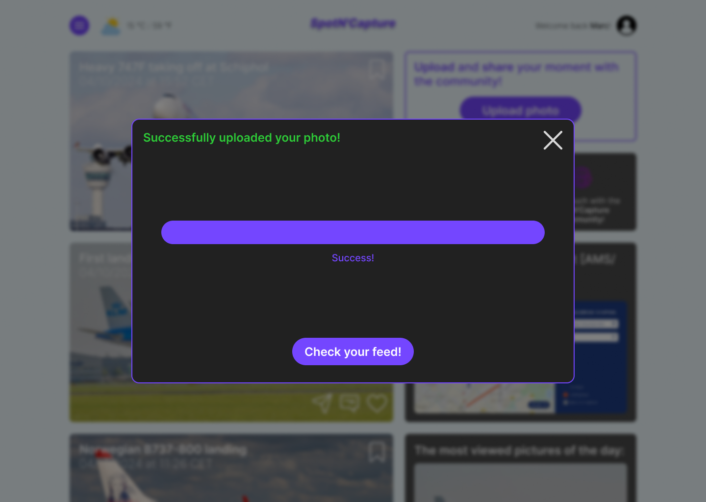
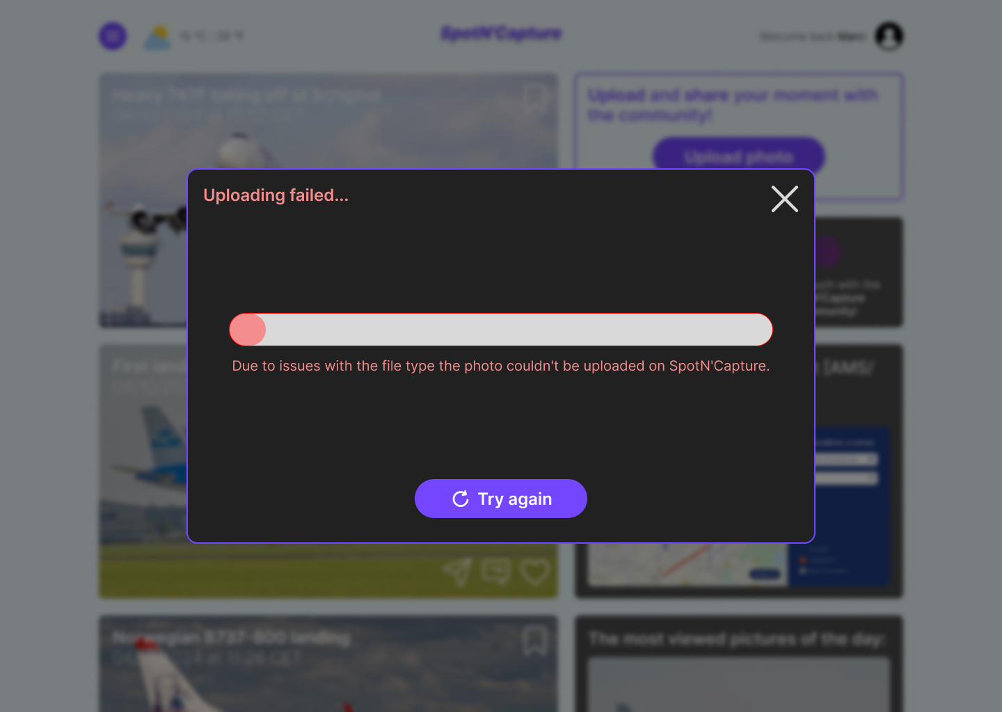
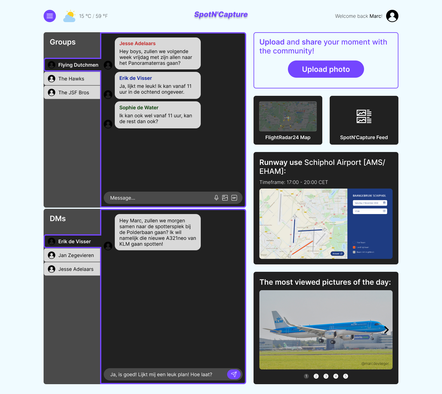
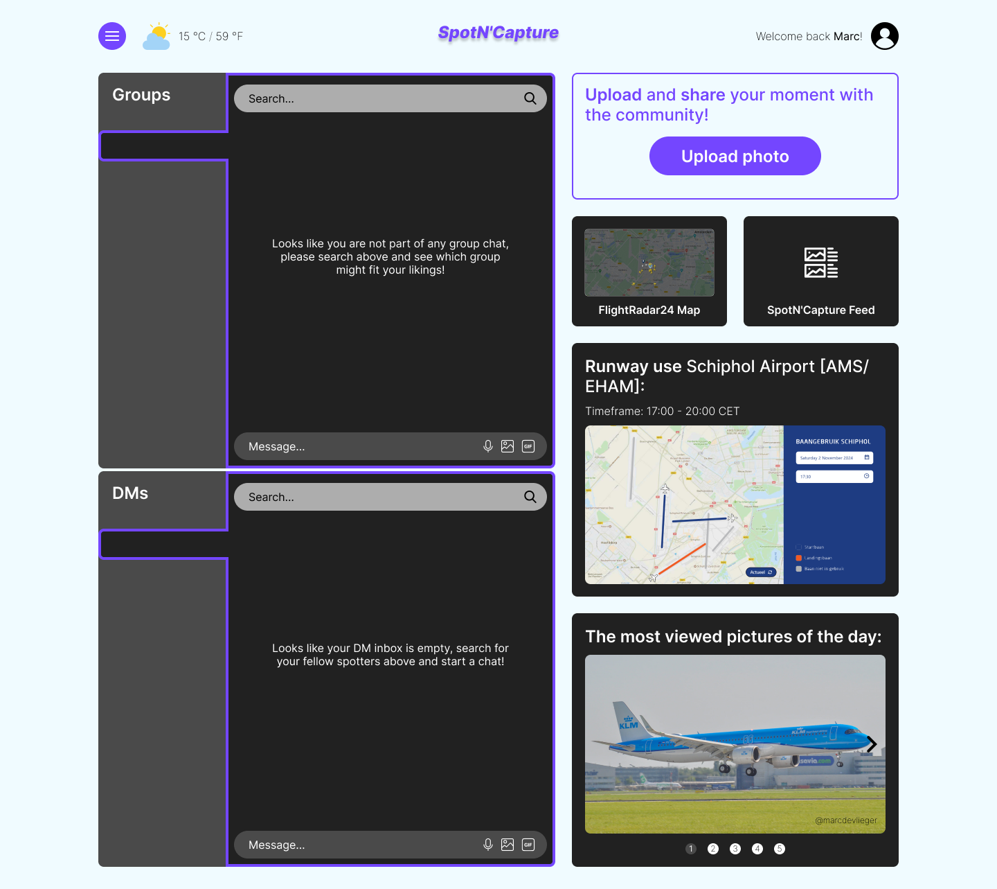
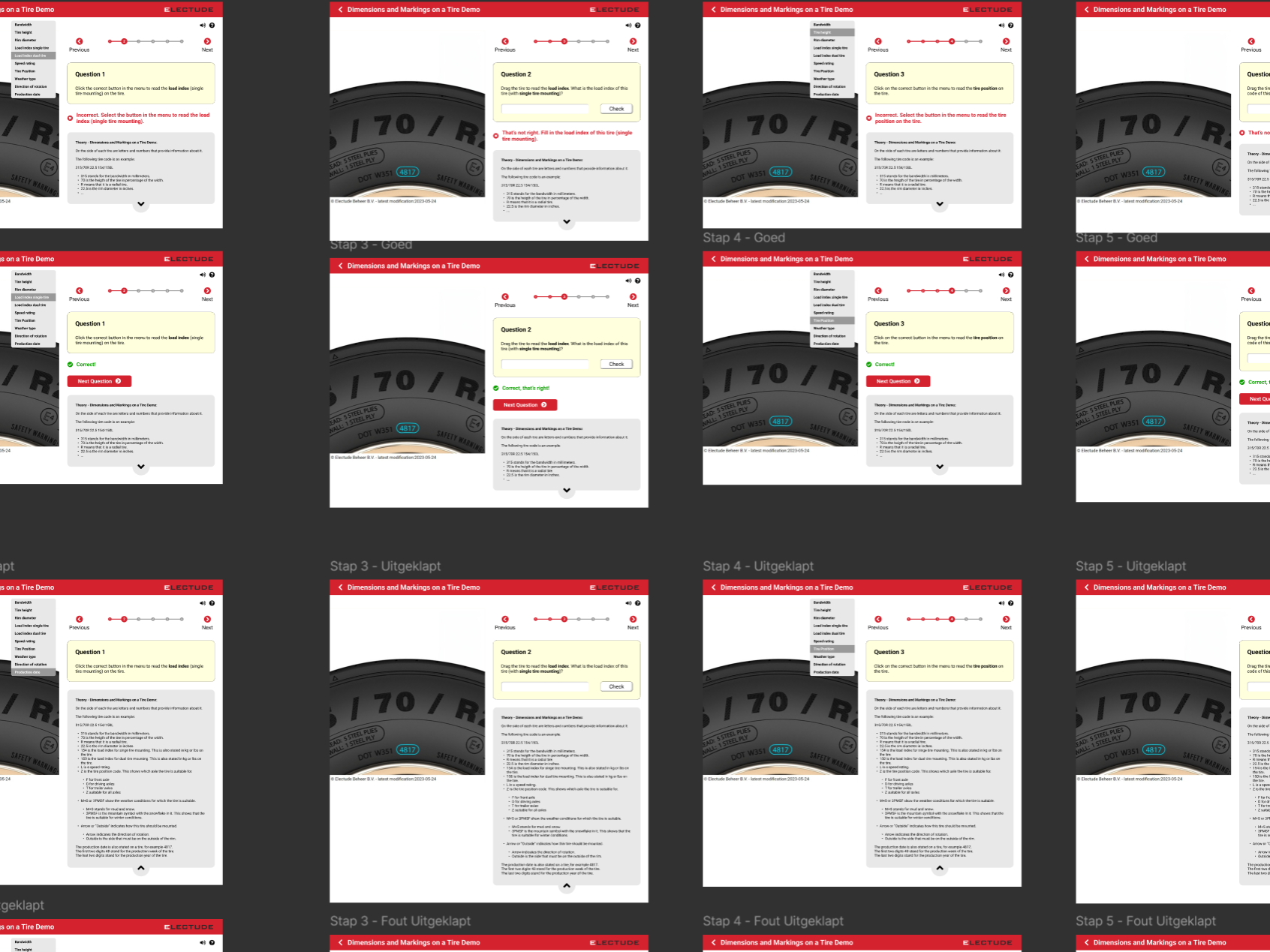
Below are the standalone Me‑/Hi‑Fi wireframes (including the full UI stack, such as the empty state, error state, ideal state and loading state) for the desktop version, followed by the fully interactive, clickable Hi‑Fi prototype of the mobile version, embedded from Figma.