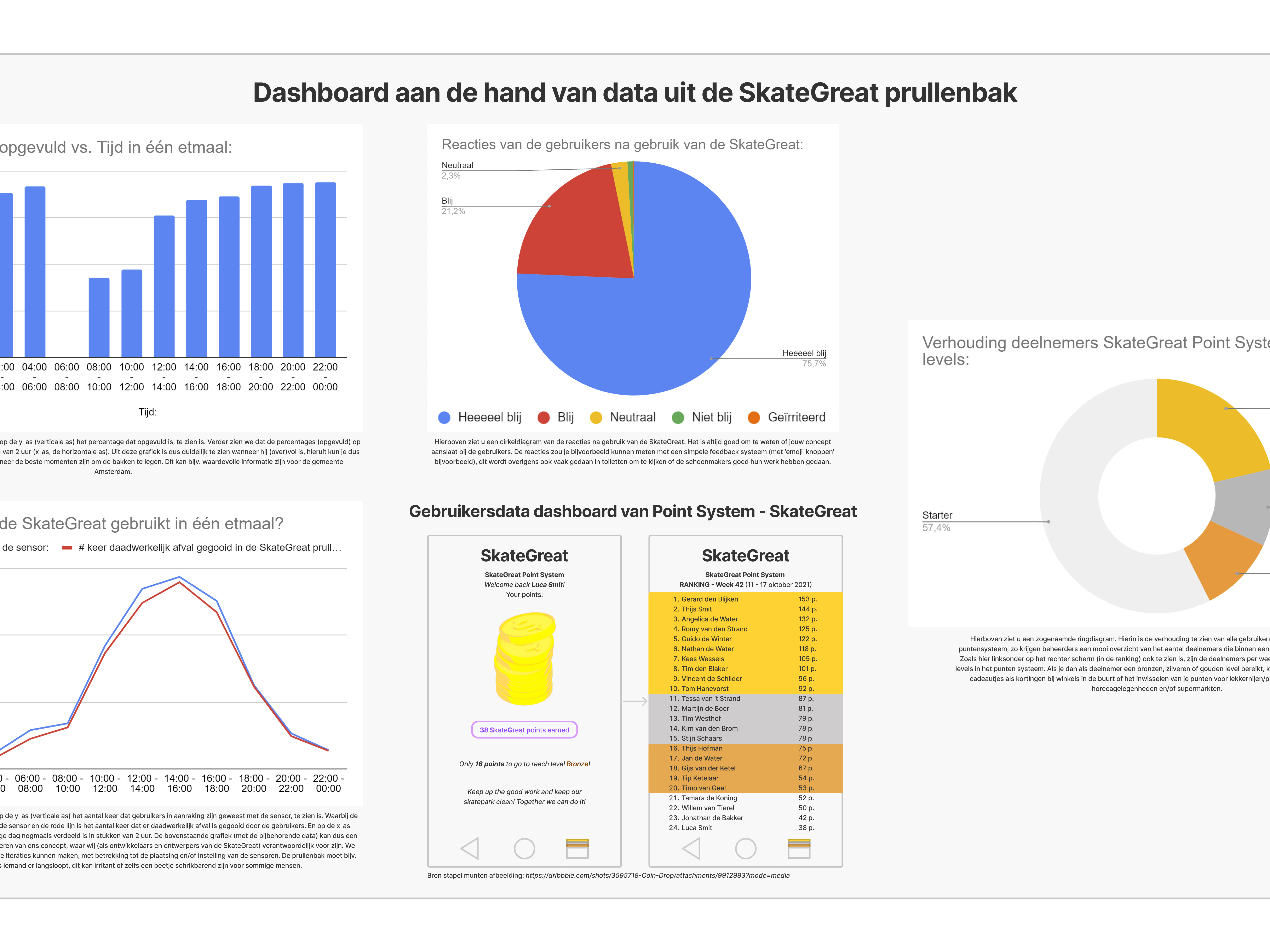
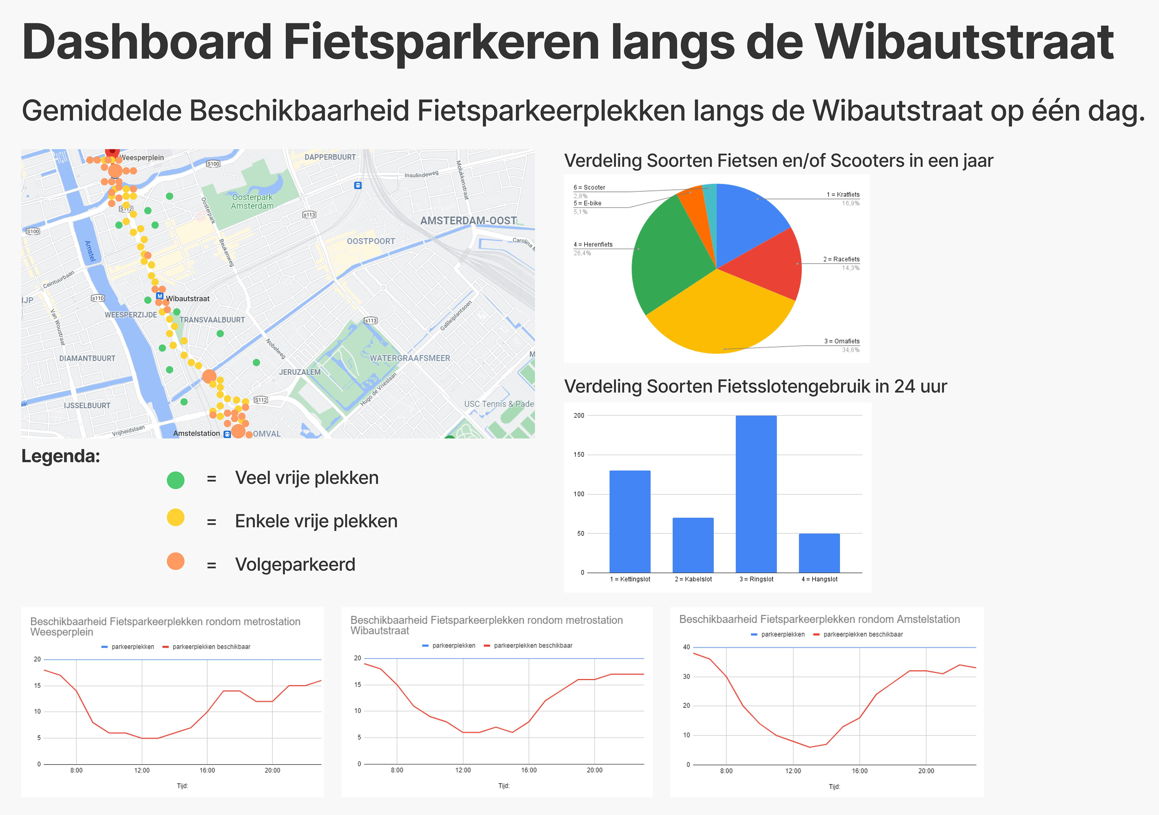
Using fictitious data, I was able to create data tables as shown below. As illustrated in the dashboard above, which was built using this data below, I distinguished between three stops/stations along the Wibautstraat. Around which station, at what exact location, and at what time are bicycle parking spaces available? This useful information can be read directly from the graphs in the dashboard above.
Such data is highly valuable to integrate into a corresponding app, especially for applications dealing with parking space availability. Since users want the most up‑to‑date overview of bicycle parking availability near their location, the data must be refreshed continuously.
Such data is highly valuable to integrate into a corresponding app, especially for applications dealing with parking space availability. Since users want the most up‑to‑date overview of bicycle parking availability near their location, the data must be refreshed continuously.
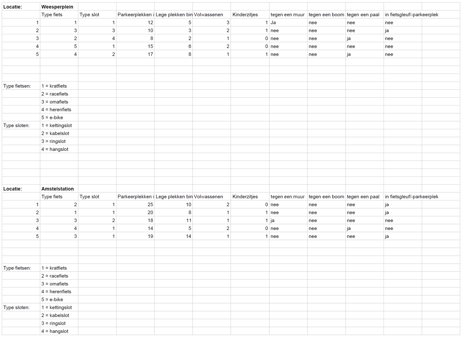
Raw (fictitious) Excel data that served as the basis for the dashboard visualizations.