State — Situation
During my five‑month internship at Tweakers, I worked as part of the Product team on several UX challenges across the platform. One of these challenges involved improving the visibility, clarity, and usability of the existing Category Browser.
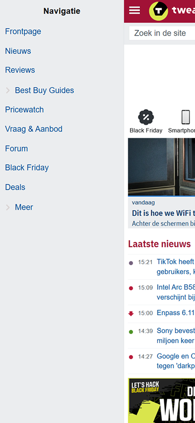
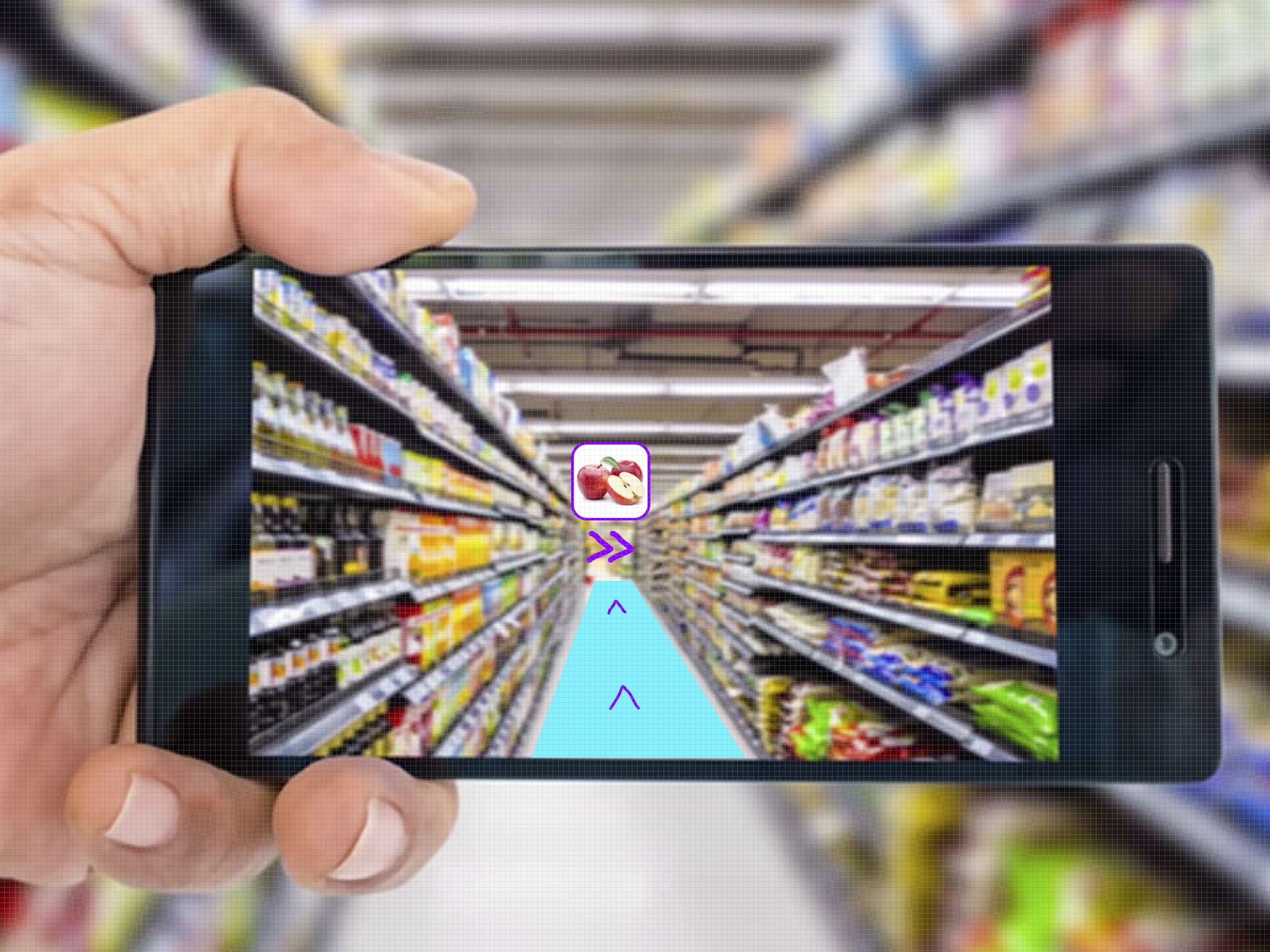
The current (or then previous) Category Browser was difficult to find because it was hidden behind the ‘Pricewatch’ button in the top navigation bar. This reduced its discoverability and disrupted the user flow. In addition, the visual representation of categories caused confusion. For example, the ‘Headphones’ (or ‘Hoofdtelefoons’ in Dutch) category displayed an image of Apple AirPods — the most popular product — while users expected a more traditional headphone image. This mismatch created a misleading impression and negatively affected recognition.
The design also lacked consistency and responsiveness across devices (mobile, tablet, and desktop), resulting in an inconsistent user experience. Using generic icons or more universally recognizable visuals would better support user expectations and reduce confusion.
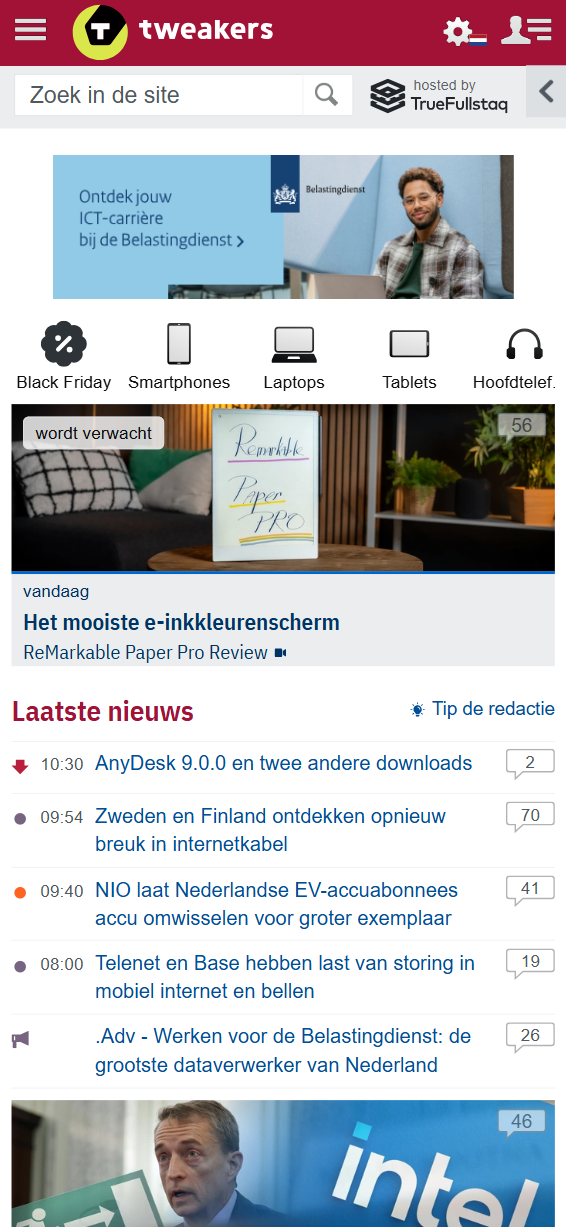
Current version of the Tweakers Category Browser on mobile, also accessible via a horizontal slider with icons.
Current version of the Tweakers Category Browser on mobile, accessible via the navigation bar or through a horizontal slider with icons (see the image beside/above).
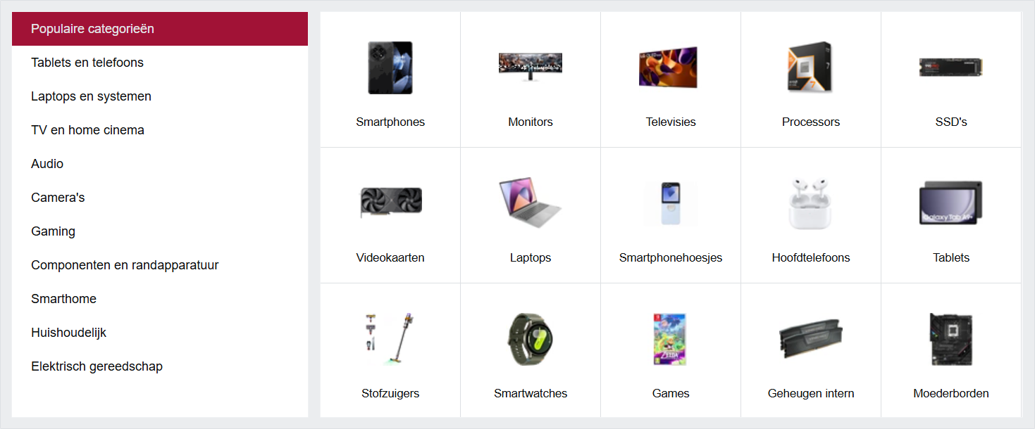
Current version of the Tweakers Category Browser on desktop. It is hidden under the ‘Pricewatch’ page in the top navigation bar, which is not convenient for users — especially first‑time visitors, who would not expect the Category Browser to be nested there. It also requires an extra click to access, instead of being immediately visible on hover or directly on the landing page. In addition, the ‘Headphones’ (or ‘Hoofdtelefoons’ in Dutch) button causes confusion because the accompanying image shows Apple AirPods (wireless earbuds) instead of traditional on‑ear or over‑ear headphones, leading to misunderstandings for many users.
Explain
To better understand the problem, I first conducted an in‑depth analysis of the current Category Browser on the Tweakers website. I examined both the usability (UX) and the discoverability of this feature. I also reviewed feedback from Tweakers users, which showed that many visitors struggled to find and understand the correct product categories.
Next, I carried out desk research into best practices for designing category browsers. This included a benchmark analysis (as shown in the first bullet point and the image below). I explored how different platforms present their categories and how easily users can navigate through them (the user flow), both on desktop and mobile. Based on this analysis, I defined several design principles:
1. Improve discoverability: Position the Category Browser more prominently within the navigation.
2. Ensure visual consistency: Use generic icons (or images) that are clear and representative of each category.
3. Optimize the user flow: Simplify the process so users can find the correct category as quickly as possible, with as few clicks or taps as needed.
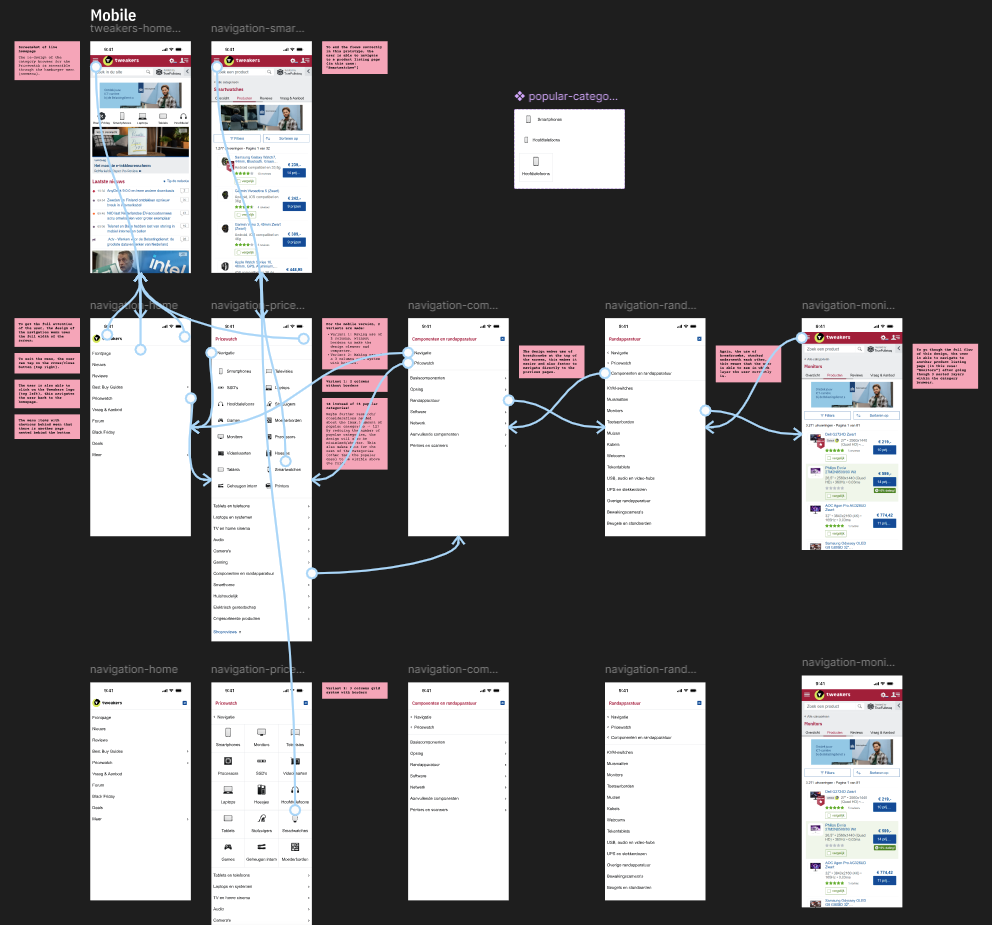
With these design principles in mind, I began creating Lo‑Fi sketches and wireframes for a renewed redesign of the Tweakers' Category Browser. I started with the mobile version and then worked my way up to the desktop version.
Design Process
For this redesign, I followed a structured design process:
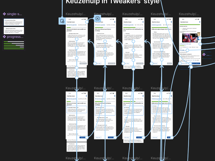
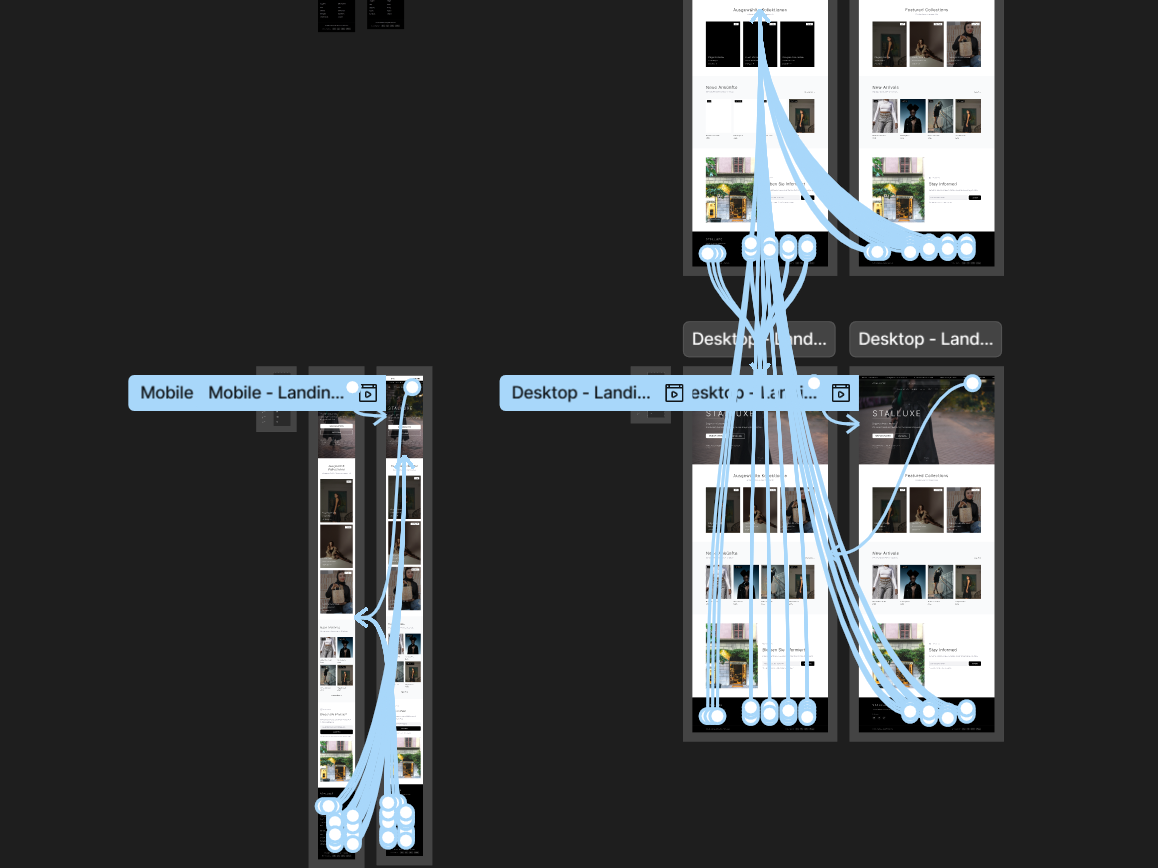
• Desk Research & Benchmark Analysis: I conducted UX research into best practices for category browsers, collecting examples from both national and international (non-Dutch) platforms such as Bol.com, Coolblue, and Amazon. I documented these findings on a large annotated Figma artboard, eventually compiling dozens of examples of category browsers and similar navigation patterns. I mapped out the ideal (happy) flow for both mobile and desktop/tablet versions and annotated key insights along the way.
• Concept Development (Conceptualization): Based on the research, I developed an ideal user flow (or happy flow) for mobile and desktop with a focus on recognizability, consistency, and intuitive navigation. Several examples from the benchmark analysis directly inspired the concept, helping me quickly converge on a direction aligned with industry standards. I applied concrete design principles and patterns — such as breadcrumbs — to create a clearer and more structured navigation experience.
• Design Decisional Record (DDR): To ensure transparency and alignment within the team, I documented all major design decisions in a Design Decision Record (DDR). This included the rationale behind chosen patterns, principles, and interaction models. The DDR served as a shared reference throughout the entire design process and is also included in the Figma file for this project.
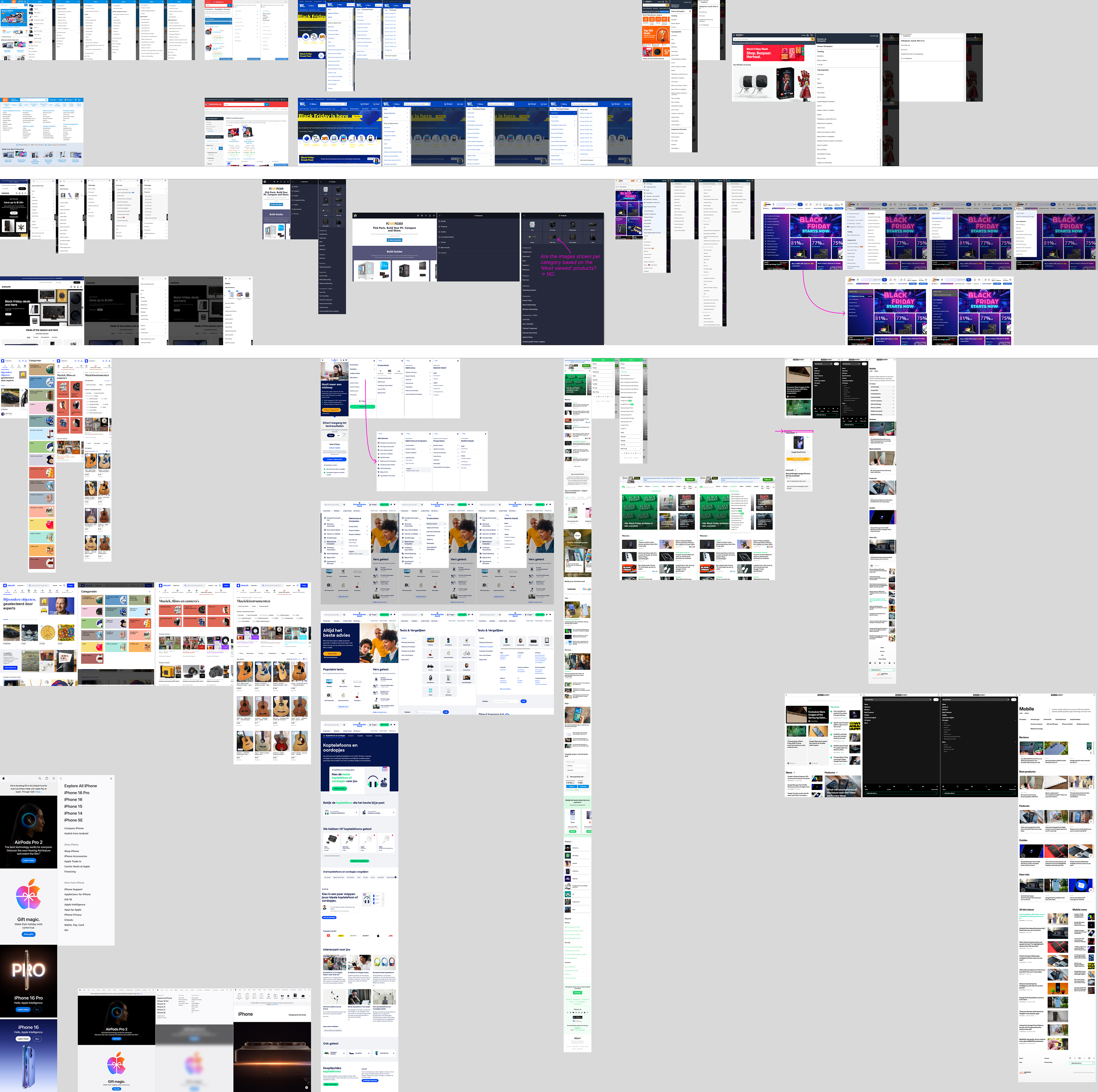
Benchmark analysis of various uses of the category browser, both nationally and internationally (including non‑Dutch websites and companies).
Illustrate — Impact
I created an interactive, responsive prototype in Figma:
• Lo-Fi (sketches) & Hi-Fi Prototype: I started with sketches and evolved them into high‑fidelity designs based on feedback from my supervisor (a senior UX designer) and the multidisciplinary Product team at Tweakers.
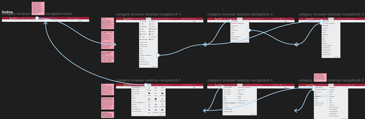
• Responsive Design: The redesign adapts seamlessly across mobile, tablet, and desktop. On mobile, users navigate vertically through a simplified structure. On desktop, users gain direct access to subcategories through the top navigation bar.
• ‘Dev Ready’ Design: I added detailed annotations to the interactive Hi‑Fi prototype to ensure a smooth handover to the development team. These annotations clarified interactions, states, spacing, and component behavior.
• Usability Testing and/or A/B-testing: The Hi‑Fi prototype was prepared for validation through A/B testing (in SiteSpect) and/or usability testing with real users.
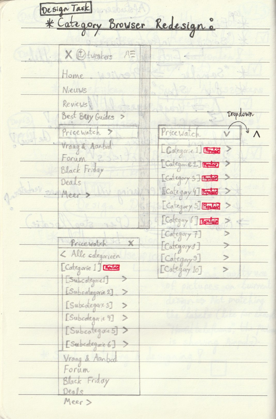
The first Lo-Fi sketches of my initial concept/designs on mobile. These early sketches differ from the final interactive Hi‑Fi prototype in Figma — for example, the ‘Popular’ (or ‘Populair’ in Dutch) labels were removed later in the process, as they added unnecessary visual noise to the navigation and the information was already available within the menu in the final iteration.
The first Lo-Fi sketches of the concept/design on desktop.
Impact
So, the final result is an interactive Hi‑Fi prototype of a redesigned Category Browser for Tweakers, designed and prototyped in Figma. This prototype includes:
• Improved positioning for better discoverability: The Category Browser has been moved to a more visible location in the desktop navigation bar, nested under the ‘Pricewatch’ button. The downward‑facing chevron clearly indicates a dropdown, where the Category Browser becomes visible once expanded.
On mobile, the redesigned Category Browser is also placed inside the hamburger navigation menu, again nested under the ‘Pricewatch’ button. Here, a right‑facing chevron indicates an additional sub‑level hidden beneath it.
Additionally, breadcrumbs are used at the top of the interface (on both mobile and desktop), allowing users to quickly navigate back to the previous page(s).
• Representative visuals, images and/or icons: Instead of showing unclear or overly specific product images — such as Apple AirPods for the ‘Headphones’ (or ‘Hoofdtelefoons’ in Dutch) category — I introduced generic, representative icons for each category. For example, the redesigned ‘Headphones’ category uses an actual, neutral over‑ear headphone icon in the Tweakers visual style (from Tweakers’ Design System).
• An optimized, shortened and more efficient user flow: The redesigned user flow and structure enables users to find the correct category more quickly and with fewer clicks or taps. The use of breadcrumbs (on both desktop and mobile) further supports efficient navigation by allowing users to return directly to a previous or parent page — a key advantage of this design pattern.
Conclusion
The new design significantly improves discoverability, provides clearer and more recognizable icons, speeds up the user flow, and delivers a consistent, fully responsive experience across all devices. The interactive prototype was well‑received by the Product team and, after successful validation, is ready for implementation in a future sprint.
(The images shown below include the interactive Hi‑Fi prototype on mobile and desktop, and the red-pink annotations used for developers, UX designers, and other team members.)

Final iteration of the interactive Hi-Fi prototype of the redesigned Category Browser on mobile, in Figma (including annotations in red-pink).
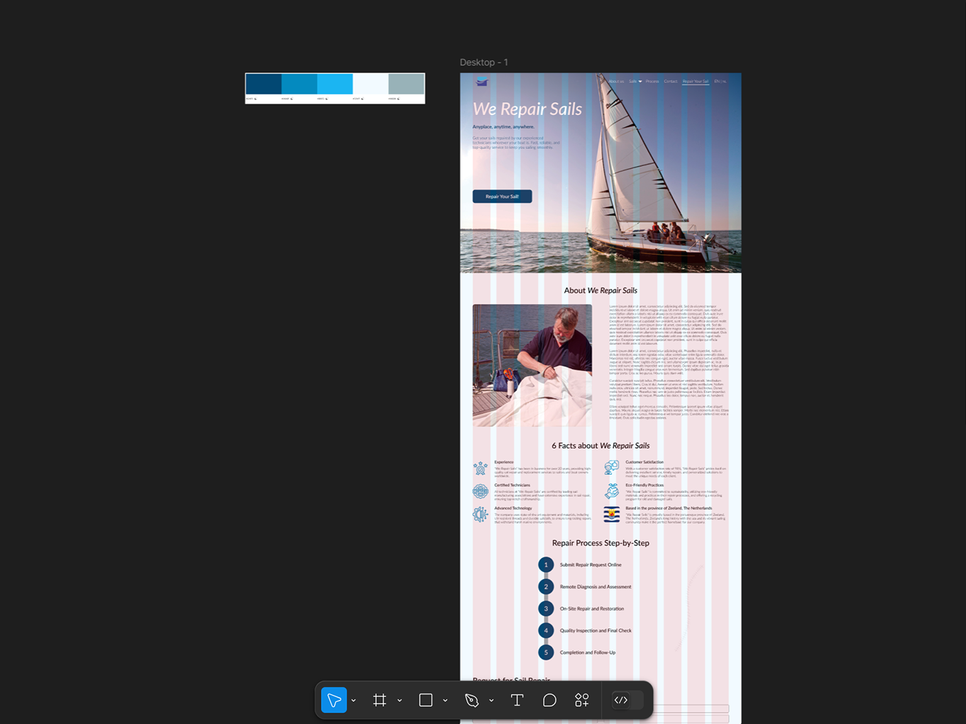
Final iteration of the interactive Hi-Fi prototype of the redesigned Category Browser on desktop, in Figma (including annotations in red-pink).
Below are the final iterations of the interactive Hi‑Fi prototypes of the redesigned Category Browser (on mobile and desktop). Both prototypes are embedded from Figma, so they are fully interactive and can be clicked through: