During my four-month internship at iO Digital Agency, I received my first assignment in the very first week from my supervisor Eddy Boeve (CRO & UX Specialist at iO), for the client Cinderella.nl.
I was asked to quickly redesign a set of mobile Hi‑Fi wireframes for Cinderella.nl, which had to be presented to the client on the same day.
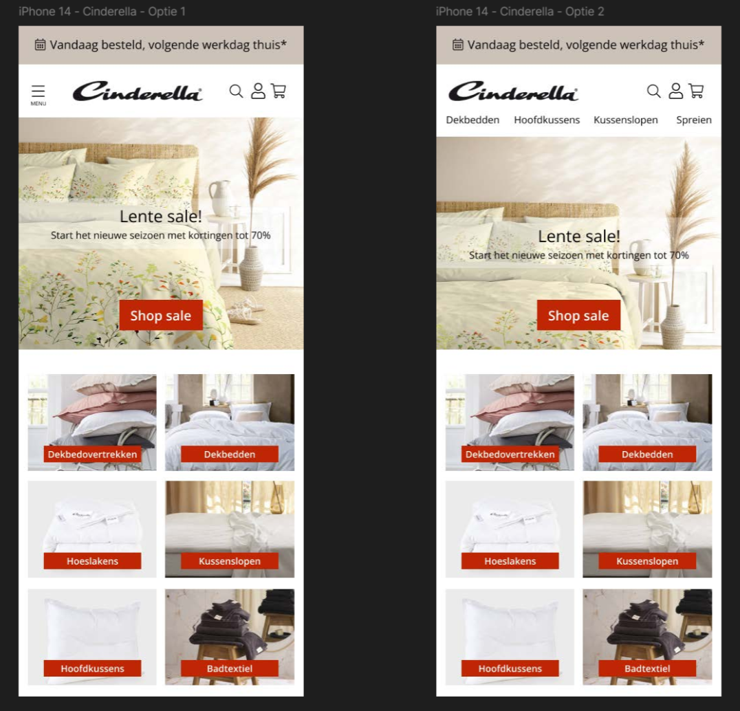
Eddy provided me with several key design elements — the font (Open Sans) and a color palette — which I used to create two different Hi‑Fi wireframes of the homepage, fully prepared for A/B testing and the client presentation.
I was asked to quickly redesign a set of mobile Hi‑Fi wireframes for Cinderella.nl, which had to be presented to the client on the same day.
Eddy provided me with several key design elements — the font (Open Sans) and a color palette — which I used to create two different Hi‑Fi wireframes of the homepage, fully prepared for A/B testing and the client presentation.
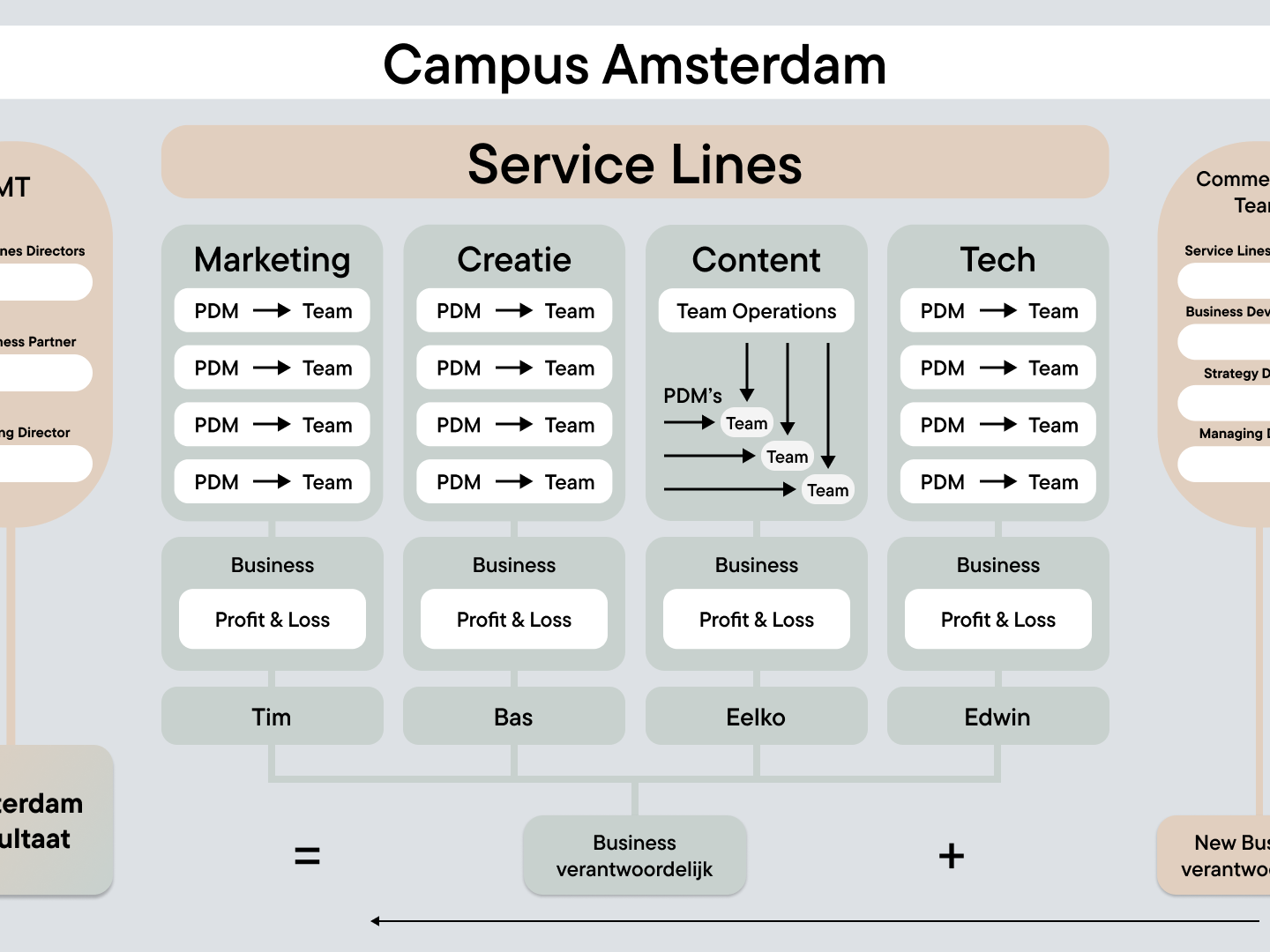
One of the requirements was to adhere to a specific primary color (HEX Color Code: #CCC2B8) that matched Cinderella.nl’s brand identity. In addition, the readability of the old website/application needed improvement, with particular attention to the six main categories used by Cinderella.nl, which had to be clearly visible in the new design.
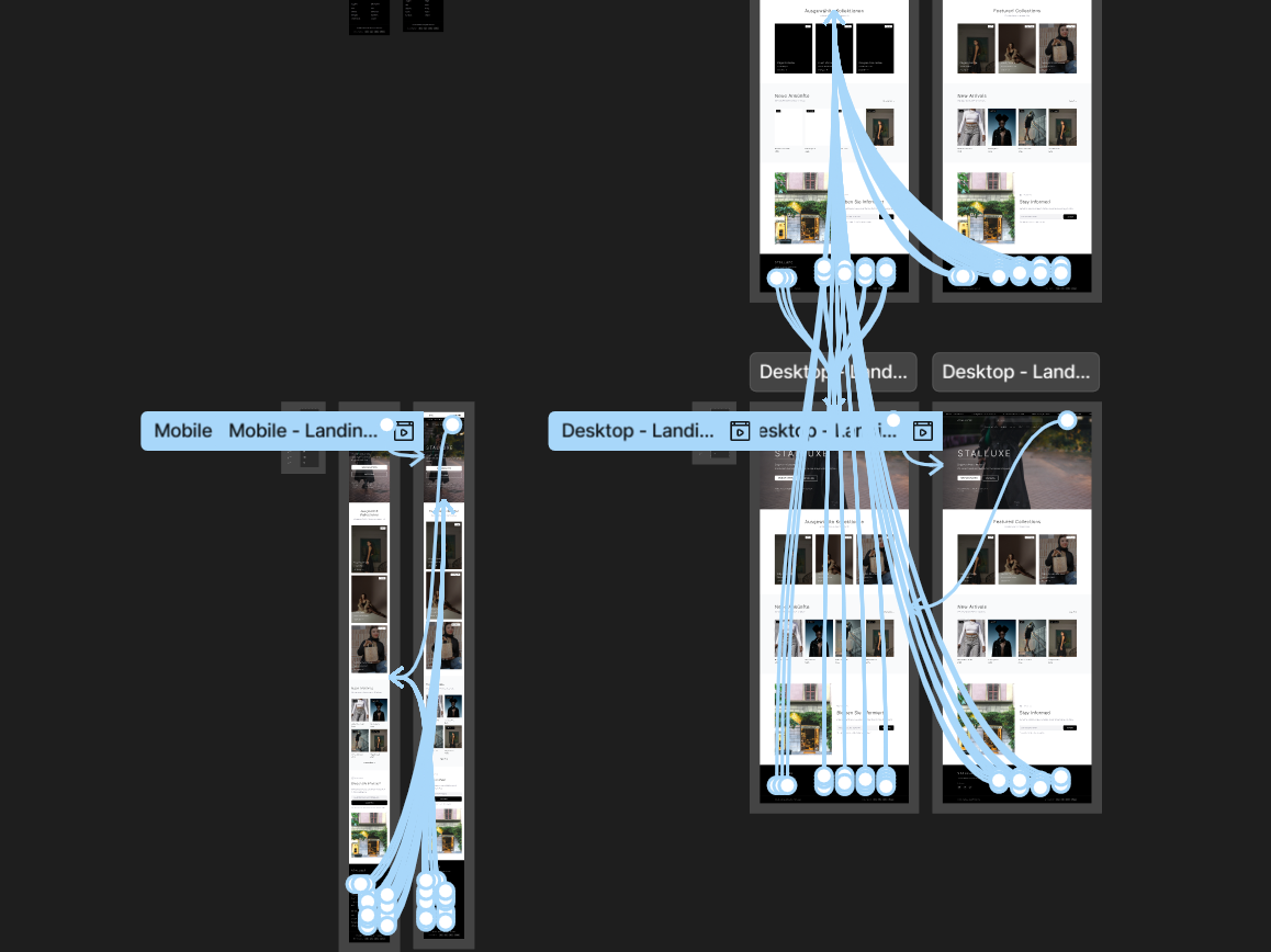
Below are the two Hi‑Fi wireframe variations. The left wireframe shows the option with a hamburger menu, while the right wireframe presents the option without a hamburger menu, allowing horizontal sliding:
Below are the two Hi‑Fi wireframe variations. The left wireframe shows the option with a hamburger menu, while the right wireframe presents the option without a hamburger menu, allowing horizontal sliding:
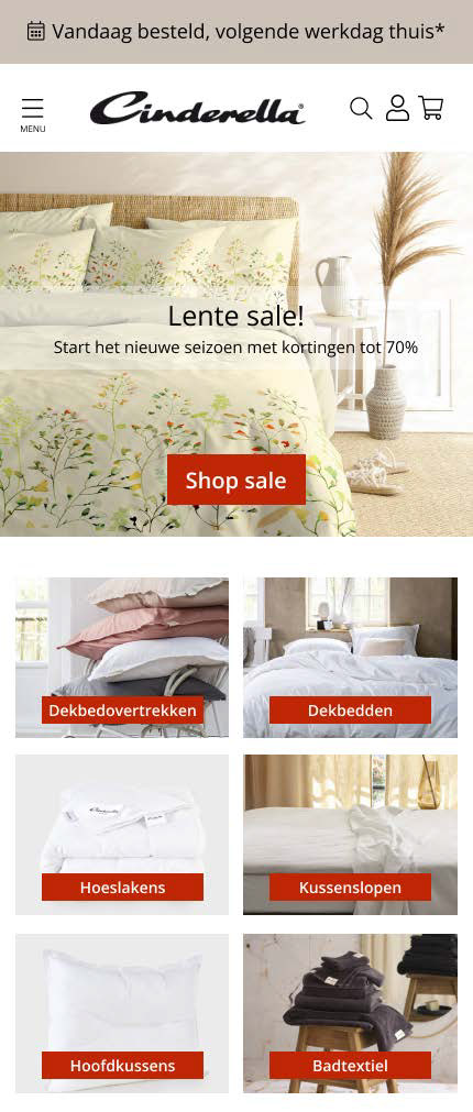
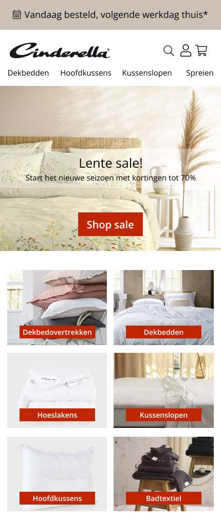
Thus, under time pressure, I quickly created two Hi‑Fi wireframes in Figma. Both my supervisor Eddy Boeve (CRO & UX Specialist at iO) and the client Cinderella.nl were very satisfied with the result. In the end, the client chose option 1 — the left wireframe, with the hamburger menu.